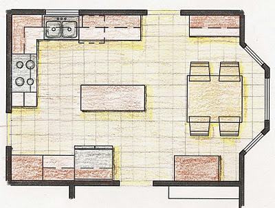
The original kitchen was designed as a separate space that did not lend itself to interaction with the adjoining spaces. There were three single openings that led to the dining room on the west, to the family room on the south and to the laundry and garage at the north. A priority for the owners was to have more openness between the kitchen and adjacent spaces without sacrificing large amounts of cabinet and counter space.
 |
| Existing North Wall |
 |
| Existing South Wall |
Maintaining some visual privacy in the kitchen to hide the working areas was also necessary. The owners also wanted to preserve the breakfast table area and bay window, redo the cabinets and counters, and replace the existing appliances in a way that appeared to be original to the house.
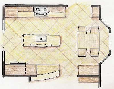
| New kitchen floor plan
|
The design solution that worked best included changes to the plan that would increase the openings between the kitchen, dining, and family rooms while still providing visual separation through the use of new pocket doors and a raised bar design which repeated at the island sink. By eliminating the ‘L-shaped’ leg where the range and microwave once stood, we were able to center the opening to the dining room and add a pair of glass pocket doors.
These doors could be left open to allow for full access or closed when more privacy was needed. The range was replaced with a cooktop which was moved to the north wall along with a set of wall ovens. The sink and dishwasher was relocated to the enlarged island with a raised ledge that shields the sink from view of the family room. The refrigerator was replaced with a counter depth refrigerator and was designed with a built-in appearance. A larger opening was added between the kitchen and family room on the south wall along with a new bar with raised ledge. The pantry cabinet was replaced with a new cabinet with pull-out shelves and better designed storage. The desk was removed to allow for a wider opening leading to the laundry, garage, and rear yard access on the north wall and a full height cabinet was added to house school and home office supplies.
 |
| View of Renovated Kitchen North Wall with New Island |
 |
| Storage for Spices and Oils |
The revised layout achieved everything the owner wanted by preserving ample counter and cabinet space, improving the access and flow between spaces and updating the kitchen’s appearance with rich earth tones and the simplistic beauty of craftsman style cabinets. The cabinet maker, Joe Davenport, worked with the homeowner to produce unique details and hidden storage areas for spices, oils, and utensils.
The new design fulfills all the home owner’s wishes and desires in a way they never imagined possible. The seamless integration of the new kitchen with the existing family room and dining room makes it impossible to imagine this house with anything other than the design that is here now. The warmth and beauty of the wood, tile, and granite work harmoniously to add character and charm to the heart of this home and the renovations have made entertaining as well as everyday use a pleasure and a joy.


